
Tips for Creating Inclusive Content for People with Dyslexia
Nearly 43.5 million Americans have dyslexia, a learning disorder that impairs reading. Commonly, people with dyslexia have trouble establishing speech sounds and correlating letters to words. Because of this, certain font styles, designs, or layouts can become distracting.
As a content creator, designer, or social media manager, it is vital to develop inclusive content that builds a welcoming environment. That’s why our team at Social Stamina compiled a list of rules that lead to dyslexia-friendly content.
Use Readable Fonts When Creating Content
Whether it's a social media graphic or website design, be sure to use dyslexia-friendly fonts. Try to swap serif fonts for sans-serif fonts – letters without extra strokes. Doing so makes letters appear less crowded and therefore more readable.

Fun tip: Arial and Comic Sans are standard sans-serif fonts, but there are many others. Try Verdana, Tahoma, Century Gothic, Trebuchet, Calibri, or Open Sans too!
Avoid using underlines, italics, all uppercase or lowercase letters as well. Each of these features can unify words, making it harder for people with dyslexia to comprehend. If you want to emphasize part of your text, bold it instead.
Be sure spacing between each letter, word, and line is a little farther – but not too far – from one another. Inter-letter spacing, or the distance between each letter, should be 35% of the average letter width; inter-word spacing should be at least 3.5 times the inter-letter spacing; line spacing should be 1.5/150%.
When Creating Graphics or Any Content, Use Contrasting Colors
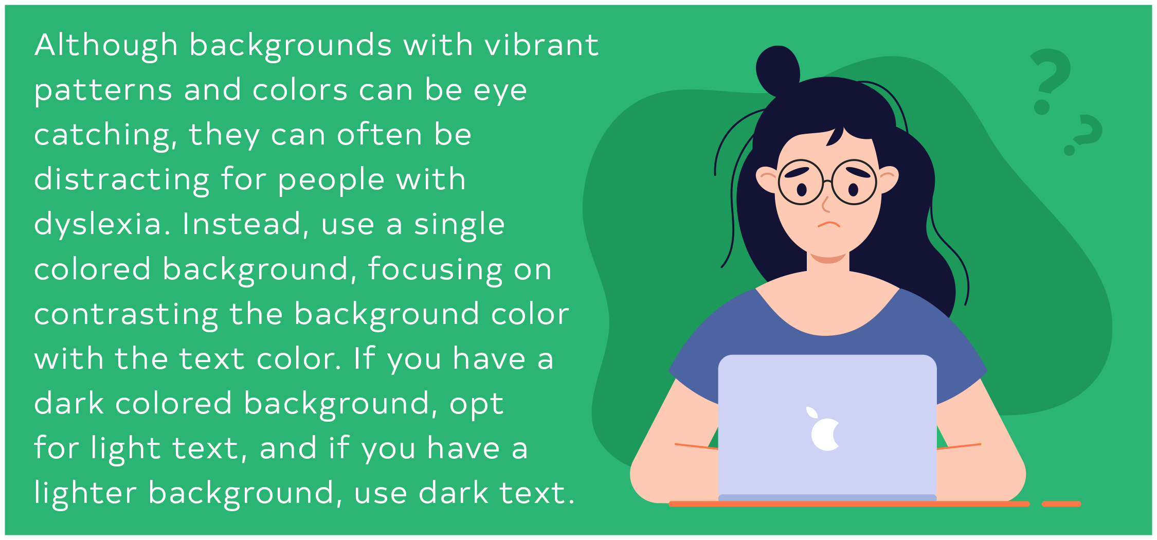
Although vibrant backgrounds can be eye-catching, they can often overwhelm people with dyslexia. Alternatively, choose a single color that contrasts with the text color you used – If you have a dark background, opt for light text; if you have a light one, opt for dark text.
When choosing a color scheme, stray away from using white as it appears harsher for people with dyslexia. If you need to use a shade similar to it in your design, pick an off-white, cream, or pastel hue instead.
Pairing green with red or pink can become a problem as well. Those with colorblindness often have trouble distinguishing these colors from one another. If possible, try to keep this in mind when formulating your brand colors!
Insert Headings to Break Up Long Sections of Text
Reading long sections of text without headings can be overwhelming. Text like that would make anyone flip the page without reading a single word!
If you have a decent amount of text, break it up with headings and subheadings – with extra spaces in between. Doing so makes it easier for people to read and more likely to engage with your content.
Keep Your Writing Style and Layout Simple
When writing text, use active voice instead of passive voice. Sentences should follow a subject-verb-object structure. For example, say “Monkeys love bananas” rather than “The bananas were loved by the monkeys.”
Passive voice not only makes your sentence longer than needed but harder to comprehend. To increase readability, limit your column use and align your text left as well.
Other dyslexia-friendly writing tips:
Keep sentences and paragraphs short
Use bullet points when needed
Avoid abbreviations
Avoid double negatives, such as “I didn’t steal nothing!”
Looking to learn more about how social media marketing can boost your business? Check out our blog for advice from our experts at Social Stamina, or connect with us for a free consultation.